
The blog on my personal insight and highlights

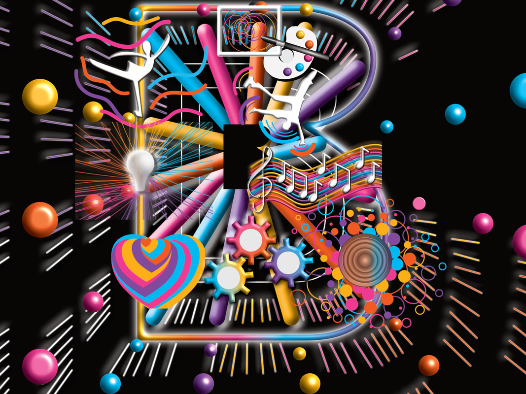 This blog provides personal insight on developing the design for the B Bold Be Birmingham Creative competition. This was a very challenging project with developing a concept very quickly and within a short amount of days. This was because I was only aware of the competition a few days before the entry deadline. Background However, I wanted to present something different from the standard techniques and styles used for bold marketing and promotion. This led to creating visual concepts to be the focal point which will draw the audience. Preparation I need to explore what aspects are needed for the projects and the message behind the design. So I brainstorm visual elements around the city identity, visual elements and showcase effects. The design visuals started with the visual environment which represents the showcase element. However, I wanted to be specific so I decided on visual effects around the abstract large letter b shape with visual elements inside the letter shape. Secondly, I start to visualise the cultural identity including art, music, dancing, industries and innovation. Each example was created separately before adding each artwork to the main design area. Secondary I develop the showcase aspects using a series of neon tube shapes and circle light bulbs in the main design area. Finally, add visual images of selected landmarks and iconic places of the city. However, the I did must not be historic to emphasize the bold message. In the complete design, the colours used were modified to specific colour guidelines. This is associated with the corporate colour scheme for the commonwealth games for Birmingham and the marketing initiatives by Birmingham City Council The design is complete in a colour blend with the "Be Bold Be Birmingham" title displayed within the colour bend shape. The overall aim is to emphasise a showcase world-class city with a strong and unique local identity. As result, the showcase is the visual interpretation of the boldness of this project. 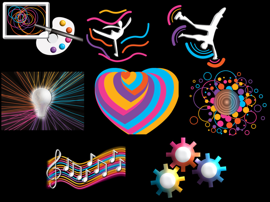  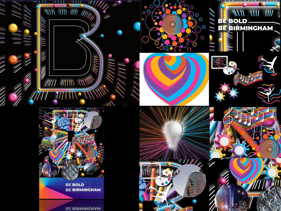 The design visuals started with the visual environment which represents the showcase element. However, I wanted to be specific so I decided on visual effects around the abstract large letter b shape with visual elements inside the letter shape. Secondly, I start to visualise the cultural identity including art, music, dancing, industries and innovation. Each example was created separately before adding each artwork to the main design area. Secondary I develop the showcase aspects using a series of neon tube shapes and circle light bulbs in the main design area. Finally, add visual images of selected landmarks and iconic places of the city. However, the I did must not be historic to emphasize the bold message. In the complete design, the colours used were modified to specific colour guidelines. This is associated with the corporate colour scheme for the commonwealth games for Birmingham and the marketing initiatives by Birmingham City Council The design is complete in a colour blend with the "Be Bold Be Birmingham" title displayed within the colour bend shape. The overall aim is to emphasise a showcase world-class city with a strong and unique local identity. As result, the showcase is the visual interpretation of the boldness of this project.  Visit the special Commonwealth Legacy feature on this website related to my involvement in the showcasing the launch city of the commonwealth games
To see this creative project in detail visit the link below
0 Comments
Your comment will be posted after it is approved.
Leave a Reply. |
Highlighting images related to leisure, events, places of interest and entertainment. In also projects linked with the featured examples.
About meI have an career background related to art & design, a participant on a music project King of the Beats and developed of series of awareness projects for local communities Archives
April 2024
Categories
All
Copyright Keith Mckenzie
All content must not be reproduced without permission 
|
 RSS Feed
